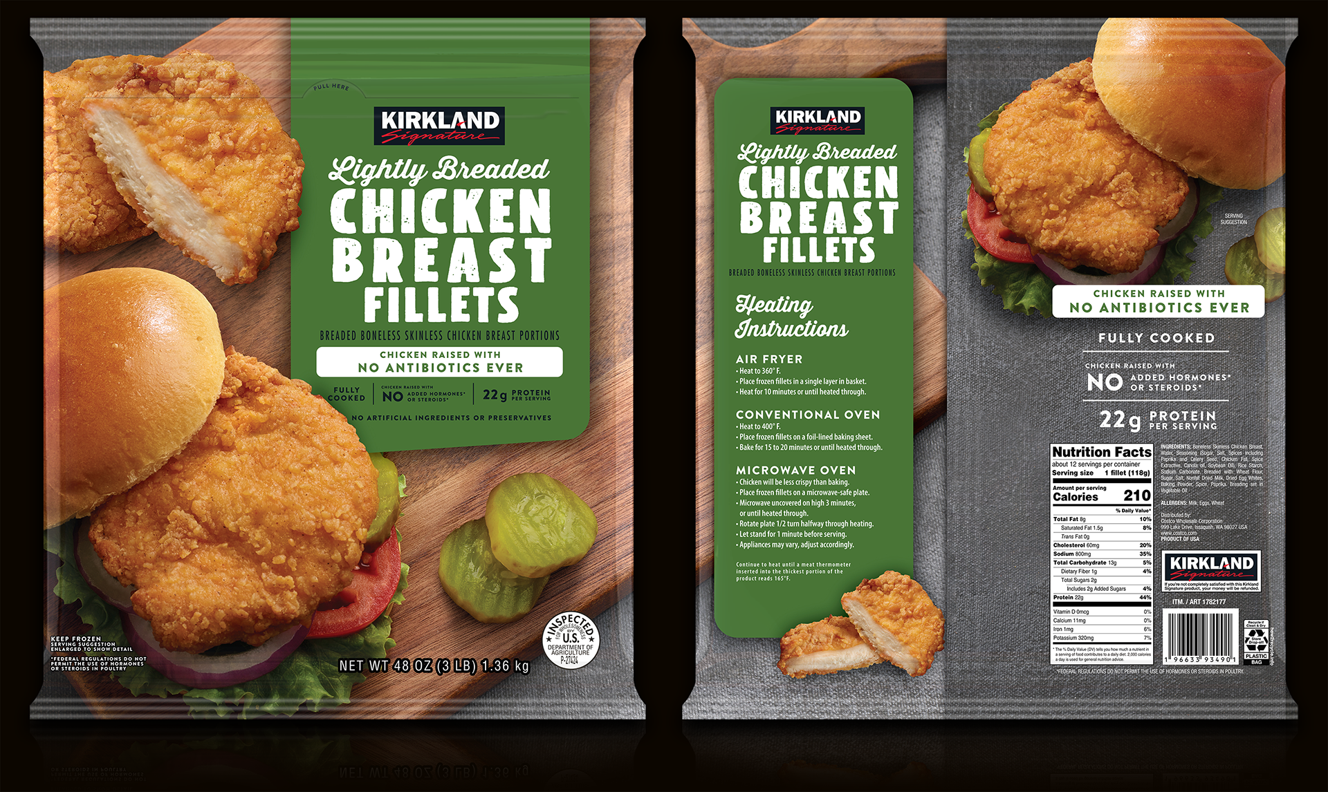
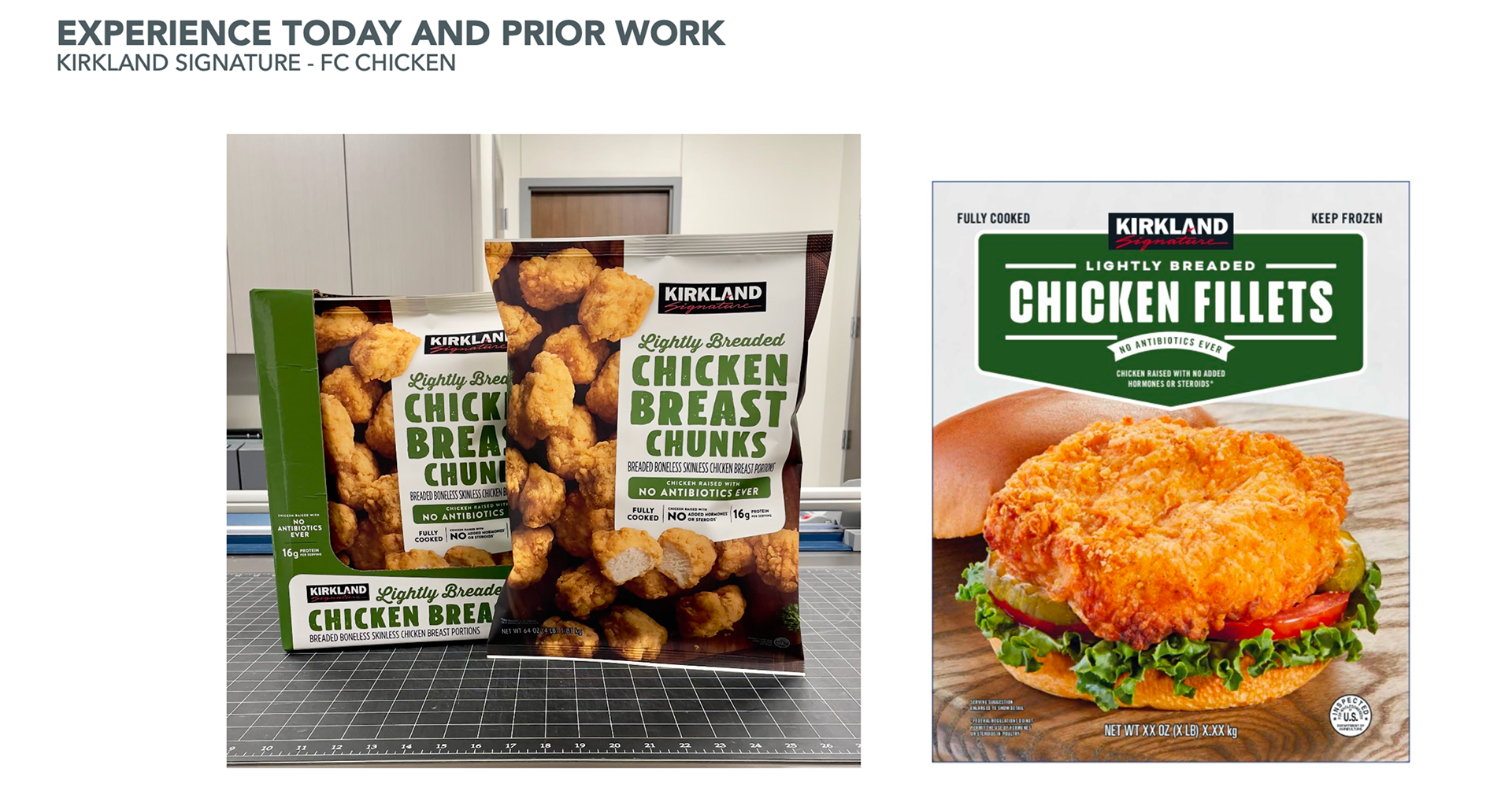
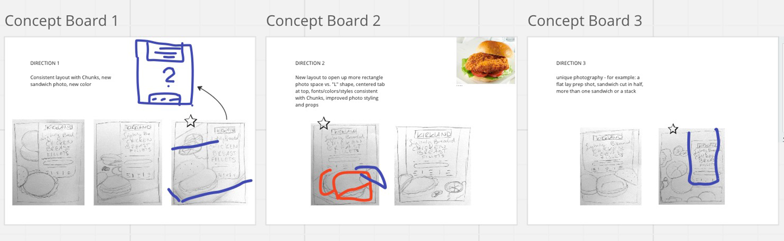
I had the opportunity to design packaging for a new product that would fit within the existing breaded chicken items produced by Crider Foods, sold under the Kirkland name. With the premium look and feel of their existing chicken breast chunks packaging, Kirkland was looking for a cohesive design to their new chicken breast fillets item within a tight turnaround. After researching market competition and reviewing client briefs, initial sketches were made followed by internal rounds of developed concepts. Three final options were presented to the client resulting in a final direction chosen to move forward for a photoshoot using actual product. Once product photography was received, final revisions were made to the design awaiting production approval.
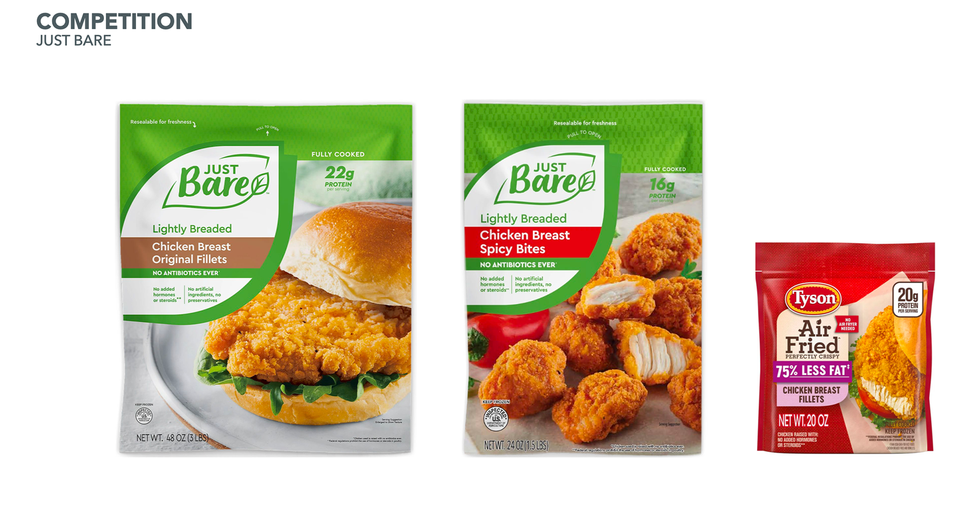
Direct in store competition and existing packaging alongside in-house initial design guidance.
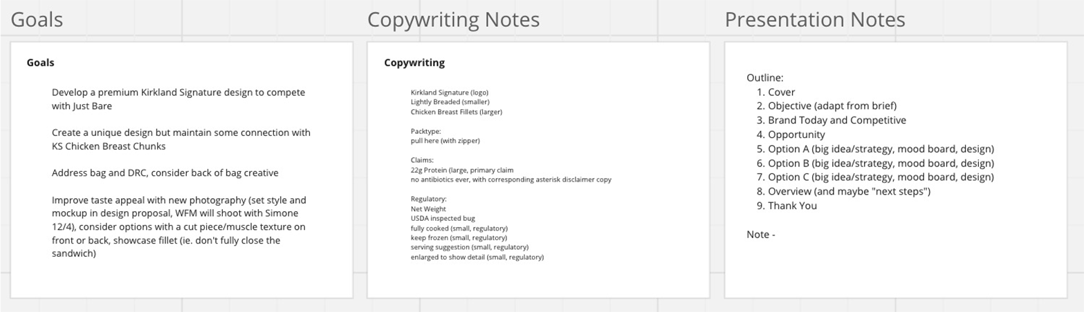
Breakdown of client brief and design hierarchy outline.
Initial sketches with suggested direction. Collaborated through Miro; shared online workspace.
Internal design options with markups and tray lip height indicated for text adjustment if needed.
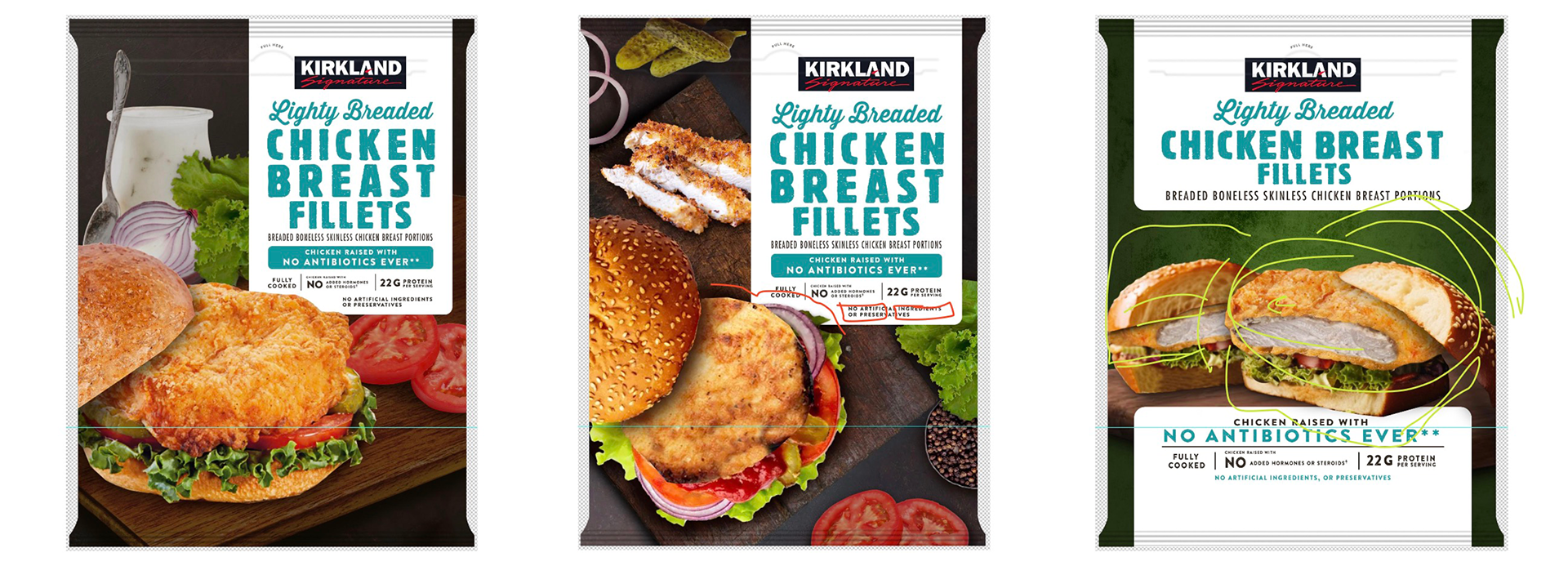
Final design option with product photography in place. High quality product photography, premium background elements to add texture. Color and Typography unifies yet individualizes packaging within product line.